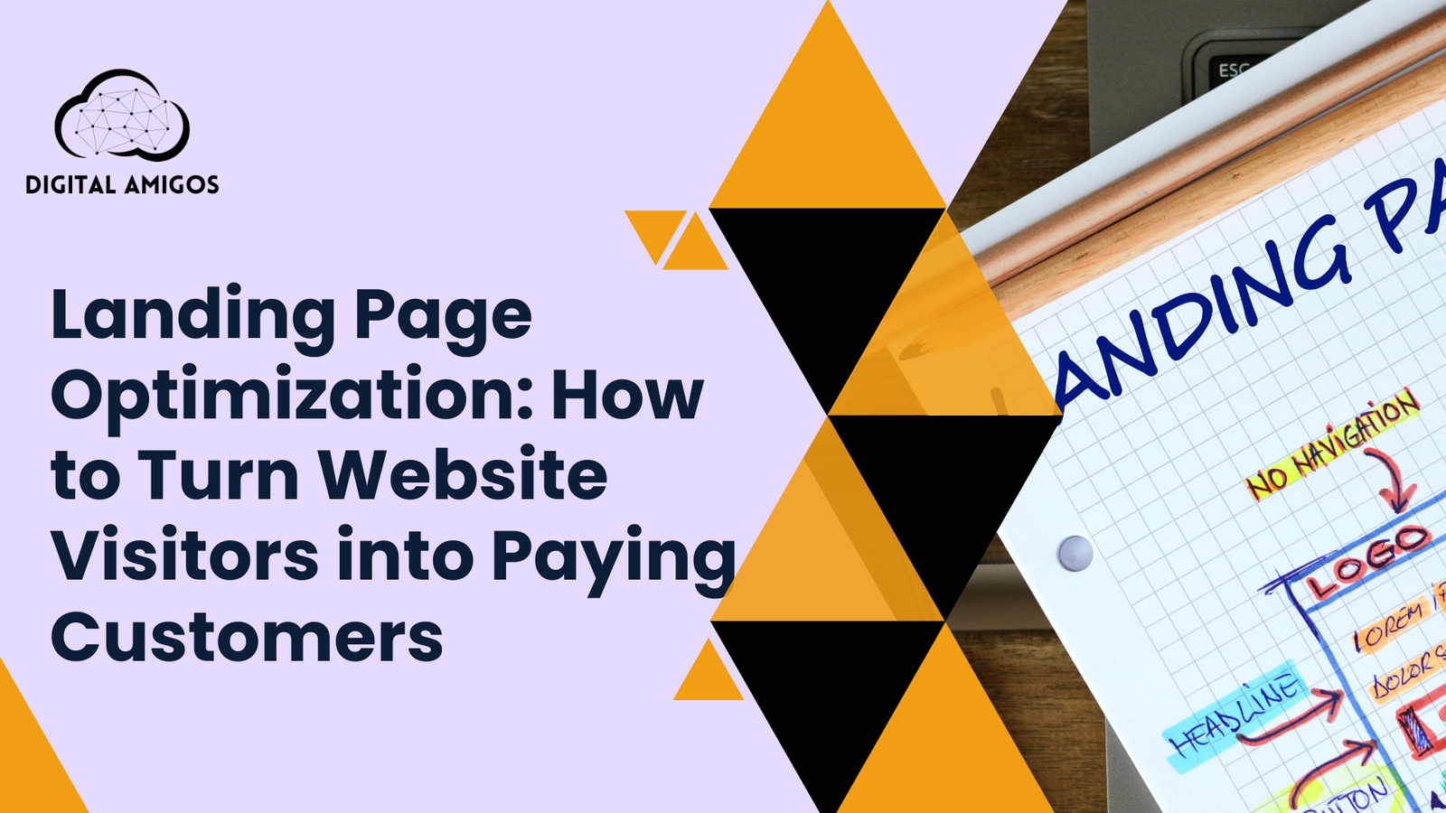
Landing Page Optimization: How to Turn Website Visitors into Paying Customers
Nowadays, drawing people to a website isn’t the biggest hurdle in online promotion. Paid campaigns, search optimization, tools like Instagram, these fill pages with clicks every day. Yet once someone lands, that’s when trouble often shows up.
A single misstep on a webpage quietly drives visitors away. Some companies assume poor traffic causes failure, yet many already attract interested eyes. What slips through isn’t interest, but direction. Pages lacking clear movement leave people pausing too long. Hesitation grows where next steps blur into noise. A strong offer means little if placement confuses. Clarity shapes choice more than features ever do. Guidance beats design when decisions stall. Movement follows cues, not just quality.
A single change on a webpage can shift attention toward action. What appears minor often decides whether someone stays or leaves. Success shows up not in traffic numbers, but in choices made by real people clicking through. Movement from view to purchase hinges on layout, clarity, and even spacing. The right message at the right moment nudges hesitation into decision.
As markets grow crowded, standing out demands more than effort. Results matter most. In India, fast choices shape success. Hesitation loses customers. Optimization isn’t a luxury. It defines survival.
This guide explains the mechanics behind effective landing pages. Many fail because they ignore user intent. Instead of guessing, companies should test changes that reflect real visitor behavior. Turning interest into action matters most, quietly and without fuss.
Landing Pages Are Increasingly Important
A decision happens here, not just browsing. This page stands apart from regular site pages.
Each element moves someone closer to action or slowly drifts them away.
Yet many companies treat landing pages like digital pamphlets. Filled with clutter instead of clarity. Packed with details that scatter attention. Missing a straightforward path forward.
A landing page must perform one main task.
Reduce confusion and increase clarity.
With clearer messaging, results rise. As understanding grows, outcomes improve naturally.
The Biggest Mistake Companies Make With Landing Pages
A single idea usually works better than a crowded message. Too much information often fights for attention. Most people skip details when overwhelmed. Clarity wins over volume. Focus shifts quickly when the point gets buried.
Truth hides when details pile up without direction. Companies think openness builds confidence, yet clutter fuels doubt.
The moment someone arrives, silent questions appear.
- Is this for me
- Can I trust this company
- What should I do next
When answers take too long, people leave.
Quiet confidence defines effective landing pages. Precision drives results, not noise.
Landing Page Optimization Begins With User Intent
Optimization starts with purpose, not visuals or wording.
A single goal shapes each landing page.
- Generate leads
- Sell a product
- Book a consultation
- Get a signup
Trying to achieve multiple goals on one page often means achieving none.
When purpose stays clear, conversion improves. Focus sharpens messaging. The path feels natural because one objective leads the way.
At Digital Amigos, user intent shapes every landing page strategy session. Vague goals cause drift. Clear intent drives results.
Headlines That Make You Pause and Read
A strong first impression often begins with one line. That opening statement carries more weight than anything else on the page.
Within seconds, visitors decide whether to stay.
Strong headlines focus on the user, not the company. They reflect what someone struggles with or wants to achieve.
Good headlines are:
- Clear
- Specific
- Benefit driven
Aim for clarity over cleverness. Visitors seek direction, not puzzles.
Supporting Copy Builds Confidence
Once attention is captured, supporting copy must reduce doubt.
Effective landing page copy focuses on:
- Explaining value clearly
- Addressing common concerns
- Keeping language simple and direct
Short paragraphs improve readability. Mid-length sections clarify value. Occasional longer paragraphs add depth and authority.
This balance matters most in competitive markets where margins are thin and clarity separates steady performers from struggling ones.
Visual Hierarchy Directs Attention
Design guides behavior quietly.
A strong layout directs attention before words do.
Key elements include:
- Headline placement
- White space
- Button contrast
- Content spacing
Crowded pages overwhelm. Space creates ease. Good design makes decisions feel easier.
Call to Action Goes Beyond a Button
A CTA does more than sit at the bottom.
High converting CTAs are:
- Clear about what happens next
- Low friction
- Aligned with user intent
Clear phrasing outperforms forceful language. When visitors feel in control, action follows more naturally.
Trust Signals Outweigh Design Trends
In conversion optimization, trust matters more than style.
Trust builds through:
- Clear brand identity
- Testimonials or reviews
- Social proof
- Transparent information
Especially in India, trust often decides outcomes. Quiet confidence outperforms loud promises.
Mobile Optimization Is Essential
Most web visits in India happen on smartphones. Yet many landing pages still prioritize desktop design.
Mobile landing page optimization focuses on:
- Fast loading speed
- Easy readability
- Thumb friendly buttons
- Minimal scrolling
Poor mobile experience drives users away quickly. Designing for mobile comes first in any conversion plan.
Fast Pages Boost Conversions
Speed influences decisions more than rankings alone.
A single extra second can reduce follow-through.
Landing page optimization includes:
- Optimized images
- Clean code
- Efficient hosting
- Minimal distractions
Fast pages feel more trustworthy. Visitors stay longer and act more often.
Forms Should Feel Effortless
Forms often create the most resistance.
Optimized forms focus on:
- Asking only what’s necessary
- Clear field labels
- Simple structure
Starting a conversation matters more than collecting every detail.
Testing Drives Better Results
There is no perfect landing page.
Optimization is ongoing.
Key areas to test include:
- Headline variations
- CTA wording
- Layout changes
- Content structure
Data replaces guesswork. Small improvements compound over time. Consistency beats one-time overhauls.
Why Landing Pages Fail Despite High Traffic
Sometimes traffic quality isn’t the issue. Alignment is.
When ads, search intent and landing page messaging don’t match, trust breaks.
Consistency across:
- Ads
- Search intent
- Landing page messaging
Is essential for conversion.
Landing Page Optimization as a Business Investment
Improving conversions often costs less than buying more traffic.
Even small gains can lift revenue meaningfully.
At Digital Amigos, landing page optimization focuses on business outcomes, not visual trends. Clarity leads every decision. Long-term performance matters more than short-term polish.
Final Thoughts
Landing page success isn’t about shortcuts. Understanding human behavior drives results.
Visitors want direction, not pressure.
Optimization works best when treated as ongoing. Small changes, tested regularly, create steady growth.
Traffic brings opportunity.
Landing pages decide outcomes.
With thoughtful design and clarity, clicks turn into customers quietly and consistently.

